Tomorrow, BREAKING OOTP returns for it’s second episode. It’s all set to go up automatically, so if it doesn’t go up, then presume that the machines have risen and overthrown me.
Until then, I now introduce to you the BREAKING OOTP logo:

Tomorrow, BREAKING OOTP returns for it’s second episode. It’s all set to go up automatically, so if it doesn’t go up, then presume that the machines have risen and overthrown me.
Until then, I now introduce to you the BREAKING OOTP logo:
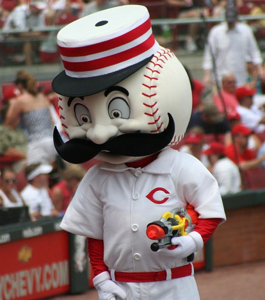
Presenting, the 2015 All-Star Game logo, which has a mustache:
We proudly introduce you to the 2015 MLB All-Star Game logo. #ASG2015pic.twitter.com/mBXNNSs8xK
— Cincinnati Reds (@Reds) August 6, 2014
This, of course, is a reference to logo/mascot Mr. Red(leg), who has a similarly epic ‘stache.
Today, I went up to Frontier Field to see the Rochester Red Wings unveil their new logo. They’d had their previous logo since the late ’90s, and I was curious to see what they’d do. Would they go retro and go fully to the ball-and-wings logo that they’d introduced as an alternate the past few years? Would it be something completely different, perhaps something with talons?
Well, it turned out to be like this:
 Not bad. Keeps the old logo’s main theme while changing it up a bit, with other logos for home, road and alternate caps. The alternate cap logo “R”, in particular, serves as a retro touch that brings to mind Specs Toporcer and Rip Collins, while also serving to make the wordmark look classy.
(JUMP… note that this is an image-intensive post)
